
As mentioned in my most recent in-progress post, I’ve been working on handmadegreetings cards based on nature and garden subjects. I took a morning walk, saw the wild garlic just coming into flower before it explodes into a globe of small flowers, and was inspired to come up with something to capture and share it.
Work in progress – May 2022

Hammerton Hall reduction linocut print
An historic farm in Lancashire, this subject arose from the photographic work of Brian Heyes.
Something about the brooding fells and the house’s many angles spoke to me. Following a small lino cut of the subject I scaled up and considered a multi-plate or reduction piece.
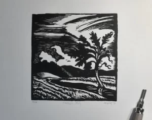
Three linocut prints in the Southport Contemporary Arts Spring Open exhibition
Today I dropped off three framed works at the ArtHouse gallery, Southport for inclusion in their Spring Open. Works include the the limited edition ‘Landscape Study’ and ‘Cherhill Down and the White Horse’, which looks great in a black frame with a white mount.
Shop update: all proceeds to Disasters Emergency Committee Ukraine Humanitarian Fund
For the foreseeable future, I will be making a personal donation to the Disasters Emergency Committee Ukraine Humanitarian Appeal every time a print is sold from this site.
If you’d like to buy a print from the Print Shop, I will make a personal donation equivalent to the sale price minus postage and packaging costs.
Please note that for sales from this site I only ship to the United Kingdom.
-
 English landscape study – limited edition A3 lino print£28.00
 -
 Cherhill Down and the White Horse, Wiltshire – original linocut print£26.00
 -
Product on sale
 The island of small joys – original linocut printOriginal price was: £45.00.£42.00Current price is: £42.00.
If you can make a direct donation yourself – great! Please follow the link above or visit their appeals page for other giving opportunities.
Eric Ravilious – print to watercolour

Wiltshire Museum is currently hosting Eric Ravilious: Downland Man, exploring the ways in which the artist’s long association with the chalk downland of southern England influenced and inspired his landscape paintings.
Guest curator James Russell presented a Zoom webinar recently offering perspectives on the man, his art, his collaborators, and the locations he visited and painted.
While familiar with many of the paintings, I was less familiar with Ravilious the man and artist. James described the artist’s process of observation that led to what are often carefully constructed lanscapes, views conjured from observed elements, repurposed and repositioned to make a new composition. This is more obvious in some works than others. His usual habit was to sketch on site and record colour notes, and then painstakingly work up full-colour compositions from those sketches back in his work room.
I had the good fortune to visit the Westbury Horse last year, the massive chalk figure overlooking the nearby town, believed to be the oldest site of its kind in Wiltshire. In his watercolour of 1939 Ravilious captured arguably the best view of the Horse’s full height, a short distance south west from the figure, with the hill dropping down to the north from the tip of the horse’s nose.
The scene is remarkably unchanged today.
Working up my own gouache sketches of the horse revealed something of the accuracy of representation in Ravilious’ work. The type of train and the chalk fragments dropping away from the hooves are the only evidence of the passing of time. The short, grassy path down to the horse’s nose is still there, 8 decades on.
At the end of the webinar, many of the questions to James referred to Ravilious’ watercolour technique, which is notably dry, spare and transparent in many of his works.
James talked about Ravilious’ painstaking technique employed on ‘final’ pieces, working on a scale not common for watercolour, and taking many hours to complete. For every completed work of this kind, Ravilious would discard three or four prior attempts and start from scratch, or as noted by one of his contemporaries (Margaret Nash perhaps?) he could often be heard running the paper under a bathroom tap, washing the paint off to begin again.
In the Westbury Horse Ravilious uses contrasting lines and hatching to describe the form of the hillside and the field systems beyond – techniques essential to relief printing, but rarely seen in ‘realist’ painting.
Ravilious is well-known for his wood engravings, and would be most familiar with the techniques of suggesting landscape forms using only black and white, and yet here are very similar marks in a full colour work.
Seeing the view in person, I was struck by some compositional differences. In particular, the train line is far more distant and difficult to make out than in the painting, and the passing trains difficult to see in detail.
Perhaps this was his way to remind us that while the view might be familiar, this is indeed a design: a collection of elements arranged, presented and described in a language that allowed him to direct our attention. Never let the truth spoil a good painting.
At the same time we have to recall that the view itself is subject to change, the current hill figure’s appearance being relatively new, and quite unlike the records we have of earlier designs on the same site.
Print shop and Etsy store temporary closure
I’ve taken the decision to close the print stores for a few months, to allow me to work on new paintings, drawings and prints. I also want to learn some new techniques, and experiment with other tools.
I am brimming with ideas and concepts that I do not get the time to explore, so this brief closure should help me realise some of those.
As a preview, I expect to be working on new, larger and more colourful prints (see my recent post on developing ideas), producing many more small paintings and exploring some techniques I’ve not used in years.
I’ll share what I can of new work in development here, on Pinterest and Twitter.
Developing print ideas
I’ve been making pictures for as long as I can remember, and have wrestled with the process and results for just as long.
Like most painters I have spells of doubt and discontent about what I do. Gaps in capability, hindrances to the work I’d like to produce will always arise, but are rarely insurmountable. Getting there can be a hard road.

Recently I have tried to re-balance the equation between a print’s development and its production. It would be usual to start the process with a rough sketch, an idea, a thread, a spark that has enough life to light the future it might fulfill. The sustaining life of the idea, the sketch or the handwritten note is as important as the work put into the final, finished piece.
So I have decided to give more life-support to an idea’s earliest days, by nurturing and reworking it in different forms and at different scales before committing to a final print design.
I began with my latest print of Cherhill Down in Wiltshire in the usual way, with pencil and gouache sketches – all at roughly the same size as the intended final print.
I moved on to working up the design large scale in soft pastel, a far cry from the sharp lines and tonal difference of a black and white relief print, and many times the size of the final piece.

Scale aside, I am working in colour, and rapidly. This permits me an intuitive response to the idea, and helps me capture feelings and atmosphere as much as the raw physicality of the view. While responding a golden sky at sunrise I am wondering to myself how I’ll represent this in just two tones. At the same time, I am in the moment of learning about the view and the image I am making.
The large, full-colour pastel is destined to be screwed up and discarded. It is a sketch, it will have problems, but it will have served its purpose in helping me devise future responses to the subject.
Adapting for print
With the subject examined through one or more sketches, I begin to paint it using pens and gouache. For this print a gouache sketch was created in my current sketchbook, and then repainted directly on the lino block. Gouache is remarkable medium for print development, every misstep can be overpainted. Over a period of a few days the lino block was amended until it roughly resembled what the final print ought to be. But from experience this is rarely the end of the design process.
Cutting commences in the ‘safest’ areas – those parts of the design that’re most satisfyingly resolved. Right up until the final cut is made I might make redrawings on the block in black or white gouache.

With this print proofing, making changes and re-proofing took a couple of days. Some missteps required the block to be patched and recut. Eventually an endpoint is reached, where the design lives up to (or gets very close to) the original concept and the developmental work that preceded it. The large pastel sketches can now be discarded.
Where next
The process was very satisfying on this print, so I am developing new subjects using the same techniques. I remain mindful of the possibilities of other approaches, but for now large scale drawing for small prints is proving both reliable and rewarding.
